
In the beginning days of HTML, every corner was a hard 90-degree angle. No curves, no shadows. Boxes. Then came rounded corners, and developers rejoiced! We didn’t have to create the illusion of rounding by adding custom images in extra markup to trick the eye. Set a radius, pick a corner (or all corners) and it had a curve. But what about other shapes? Again, we were forced to get creative with illusions to show the shapes we wanted.
Enter corner-shape! At the time of writing (August 2026) the support is not complete, so some browsers will fallback to a rounded corner, but for those that support the style, we can deliver a wider range of corners now.
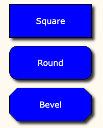
Example of bevel corner-shape along with previous square and rounded styles.
This can be easier to visualize (and certainly more fun) to work with interactively… use the options below to see it in action! This is a simplified example… keep in mind that each corner can have independent border-radius, so you have more control over the size of each effect. Hover over the Playground to temporarily set border-radius to 0, effectively removing the corner-shape.